Thursday 30 May 2013

Baroque art design development

 
I decided to explore the concept of negative and positive space in design. So I researched artists such as M. C Escher who has created some illusionist art and Victor Vasarely a French painter who has also created some illusionist/op-art.


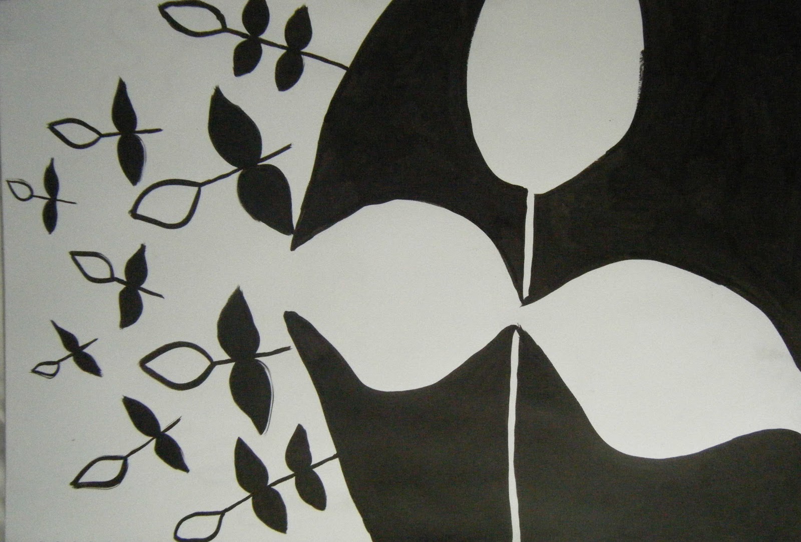
The charcoal design was created using an eraser, I really like the effect this has created because it is quite textural. I also like the contrast of black and white in the above designs as it makes them bold and intriguing. The third design was drawn using the blind continuous line technique which I think has worked really well and is my preferred drawing technique as you get fluid lines which make the design more abstract.

Baroque art

I have also produced a project on Baroque art as I like the style of that period. I started my research by drawing inspiration from original art work from that period such as Daniel Marot's pieces and key architectural designs. The image below shows a blind continuous line drawing which has bold fluid lines which are typical of the Baroque period.


The other designs are also typical of the Baroque period. I really like some of the floral shapes and wavy lines. The challenge now was to make the designs more abstract and appropriate for my chosen market of lighting designs.

Thursday 16 May 2013

Product illustrations and final fabric print

For two of my bedding designs I created product illustrations. The first is from my Bright Colours collection. I think the pattern is suitable for bedding and the colours are also appropriate. The second is from my Luxury collection, this design has more complex motifs and an interesting layout. Both designs are reversible. 


The following photographs show another two of my final designs printed to scale on fabric. The left hand side shows a Luxury design which has a less complicated layout than the one above to draw attention to the individual motifs. The other design is from my Bright Colours collection, I really like this pattern because it has a mixture of complex and simple motifs. For all of my designs I tried not to use too many colours as this can spoil the design. I think both designs show an appropriate amount of colour.


Sunday 5 May 2013

The last of my final designs

I have finally finished all my bedding collection designs. There are 10 designs in all from two collections- luxury and bright colours. They are both based on the theme of Life Cycles.
The first two designs are from my luxury collection and show the front and reverse of a duvet cover. I really like the colours in the first design and the placement of the motifs as they lead you across the page.


The four designs above are from my bright colours collection and show front and reverse designs for a duvet cover. Some of the motifs are textural which makes the design more intersting. I really like the eye-catching flower motif in the above design.