The following drawings are from my first year at university where we focused on detailed drawings of plants. The aim of the project was to enable us to define our own drawing style. I have learnt a lot throughout the two years I have completed at university. In particular I have found that I like drawing with charcoal and ink and using techniques such as blind continuous line and negative space. The projects have also helped me decide which direction I want to take my work in, which is interior design for wall paper or lighting.
Monday, 17 June 2013
Tuesday, 4 June 2013
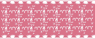
Final laser cut designs
I have created two collections of four designs for use as a lampshade. Collection one has few motifs while collection two has border designs. I think they both relate to my Baroque art theme. The designs below are from my first collection. I have experimented with scale in my designs and this makes them more interesting. The fourth design has been laser cut from satin. I think this is an appropriate lampshade design as it won't let too much light through.
The four designs above are from my second collection. I think the borders make the designs suitable for use as a lampshade. I think the placement of the motifs is more interesting in this collection as they lead the viewer's eye across the design. The last design has been laser cut out of cotton. Overall I am pleased with both collections.
Sunday, 2 June 2013
Saturday, 1 June 2013
Laser cut designs
The images below show some of my initial laser cut designs. The first design is laser cut foam, I like the repeat pattern in the middle as it is eye-catching. I think the small motifs are appropriate for a lampshade but the material choice needs more consideration. Similarly the felt design is not suitable for a lampshade as some of the smaller motifs didn't cut out properly.
The other laser cuts show individual motifs that I considered using in my lampshade designs. I think they reflect my theme but the thin lines may be a problem as they could snap. Therefore I need to change the design.
Baroque art further development
I developed my ideas further by producing some more ink drawings. The design below shows an experimentation with overlapping motifs. I like the idea of this but I don't think it is reflected very well in this design and I should have used a brighter red to create a stronger contrast.
The design in the middle shows a paper cut of one of my earlier designs. I think this has worked well however some of the lines are a bit thin and may snap when laser cut from fabric. The other design shows experimentation with shape and colour and it reflects my Baroque art theme.
Subscribe to:
Comments (Atom)


