Please complete my survey on wearable electronics below
https://www.surveymonkey.com/s/82KD8MC
Saturday, 21 December 2013
Sunday, 14 July 2013
Repeat patterns and detailed drawings
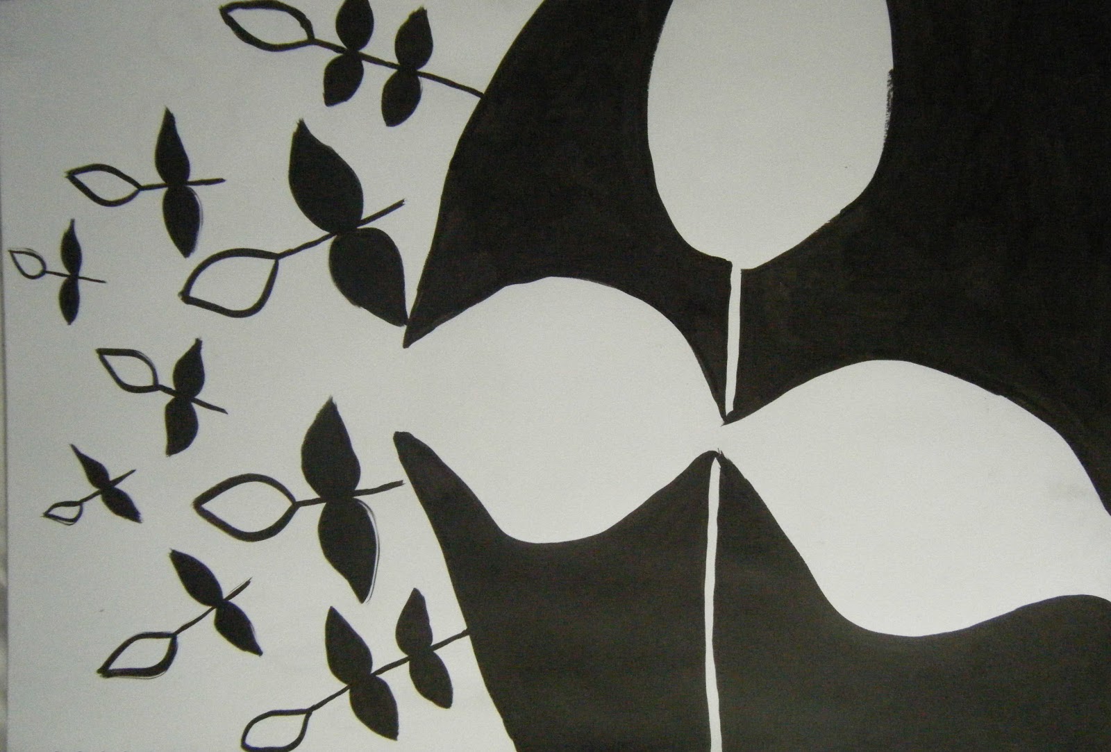
The two drawings below are from my first project of detailed plant drawings. They show experimentation with tone and texture. I really enjoyed this project as it allowed me to develop my own drawing style and experiment with different media.


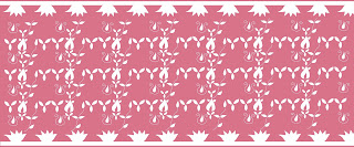
The next step was to develop these drawings into repeat patterns. This enabled me to experiment with scale and placement of motifs with the aim of creating a visually appealing outcome. The following designs all have different qualities such as tone, contrast and leading lines. Overall I am happy with the outcome of both projects as I feel they are visually appealing and have enabled me to vastly improve my drawing skills.


Monday, 17 June 2013
Drawing from nature
The following drawings are from my first year at university where we focused on detailed drawings of plants. The aim of the project was to enable us to define our own drawing style. I have learnt a lot throughout the two years I have completed at university. In particular I have found that I like drawing with charcoal and ink and using techniques such as blind continuous line and negative space. The projects have also helped me decide which direction I want to take my work in, which is interior design for wall paper or lighting.


Tuesday, 4 June 2013
Final laser cut designs
I have created two collections of four designs for use as a lampshade. Collection one has few motifs while collection two has border designs. I think they both relate to my Baroque art theme. The designs below are from my first collection. I have experimented with scale in my designs and this makes them more interesting. The fourth design has been laser cut from satin. I think this is an appropriate lampshade design as it won't let too much light through.


The four designs above are from my second collection. I think the borders make the designs suitable for use as a lampshade. I think the placement of the motifs is more interesting in this collection as they lead the viewer's eye across the design. The last design has been laser cut out of cotton. Overall I am pleased with both collections.
Sunday, 2 June 2013
Laser cut designs
These are some of my laser cut designs that will be cut out of fabric suitable for a lampshade.


Saturday, 1 June 2013
Laser cut designs
The images below show some of my initial laser cut designs. The first design is laser cut foam, I like the repeat pattern in the middle as it is eye-catching. I think the small motifs are appropriate for a lampshade but the material choice needs more consideration. Similarly the felt design is not suitable for a lampshade as some of the smaller motifs didn't cut out properly.


The other laser cuts show individual motifs that I considered using in my lampshade designs. I think they reflect my theme but the thin lines may be a problem as they could snap. Therefore I need to change the design.
Baroque art further development
I developed my ideas further by producing some more ink drawings. The design below shows an experimentation with overlapping motifs. I like the idea of this but I don't think it is reflected very well in this design and I should have used a brighter red to create a stronger contrast.


The design in the middle shows a paper cut of one of my earlier designs. I think this has worked well however some of the lines are a bit thin and may snap when laser cut from fabric. The other design shows experimentation with shape and colour and it reflects my Baroque art theme.
Thursday, 30 May 2013
Baroque art design development
I decided to explore the concept of negative and positive space in design. So I researched artists such as M. C Escher who has created some illusionist art and Victor Vasarely a French painter who has also created some illusionist/op-art.


The charcoal design was created using an eraser, I really like the effect this has created because it is quite textural. I also like the contrast of black and white in the above designs as it makes them bold and intriguing. The third design was drawn using the blind continuous line technique which I think has worked really well and is my preferred drawing technique as you get fluid lines which make the design more abstract.
Baroque art
I have also produced a project on Baroque art as I like the style of that period. I started my research by drawing inspiration from original art work from that period such as Daniel Marot's pieces and key architectural designs. The image below shows a blind continuous line drawing which has bold fluid lines which are typical of the Baroque period.


The other designs are also typical of the Baroque period. I really like some of the floral shapes and wavy lines. The challenge now was to make the designs more abstract and appropriate for my chosen market of lighting designs.
Thursday, 16 May 2013
Product illustrations and final fabric print
For two of my bedding designs I created product illustrations. The first is from my Bright Colours collection. I think the pattern is suitable for bedding and the colours are also appropriate. The second is from my Luxury collection, this design has more complex motifs and an interesting layout. Both designs are reversible.


The following photographs show another two of my final designs printed to scale on fabric. The left hand side shows a Luxury design which has a less complicated layout than the one above to draw attention to the individual motifs. The other design is from my Bright Colours collection, I really like this pattern because it has a mixture of complex and simple motifs. For all of my designs I tried not to use too many colours as this can spoil the design. I think both designs show an appropriate amount of colour.


Sunday, 5 May 2013
The last of my final designs
I have finally finished all my bedding collection designs. There are 10 designs in all from two collections- luxury and bright colours. They are both based on the theme of Life Cycles.
The first two designs are from my luxury collection and show the front and reverse of a duvet cover. I really like the colours in the first design and the placement of the motifs as they lead you across the page.


The first two designs are from my luxury collection and show the front and reverse of a duvet cover. I really like the colours in the first design and the placement of the motifs as they lead you across the page.


The four designs above are from my bright colours collection and show front and reverse designs for a duvet cover. Some of the motifs are textural which makes the design more intersting. I really like the eye-catching flower motif in the above design.
Subscribe to:
Comments (Atom)